
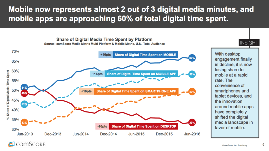
Mobile Internet usage numbers have exploded, and there’s no looking back. Traffic for mobile data has grown 18-fold over the past five years. And in 2021, the number of mobile-connected devices is projected to surpass the world’s population – 11.6 billion – in a global population of 7.8 billion.
By these numbers alone, it’s clear that mobile is a huge game changer to any marketing strategy.
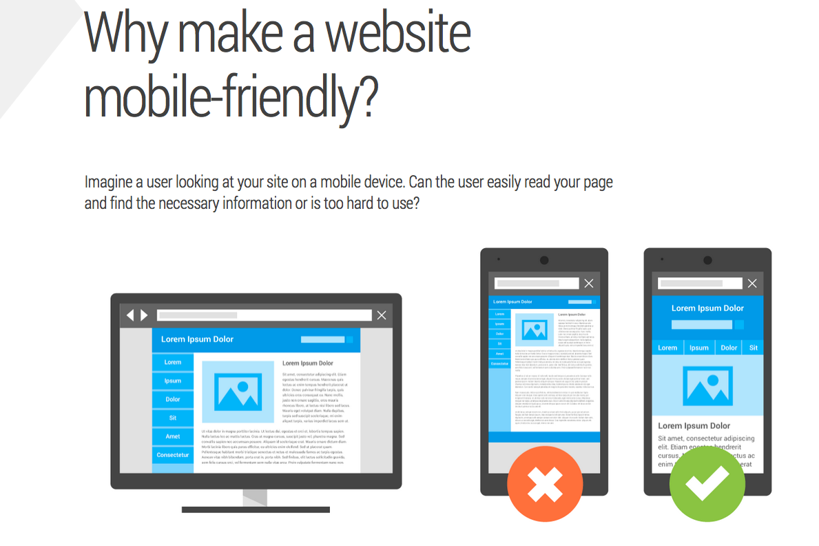
Mobile users consume information on a real-time basis while on the go. However, many website designs still do not account for different screen sizes and page load times which frustrate the users.
It’s important that your site gives them the information they need immediately or else they’ll abandon the site and look somewhere else to find similar information. When that happens, not only are you driving potential leads to your competitors, you’re also hurting your bottom line.
So how do you make your site mobile-friendly? And how do you optimize it for mobile SEO?
This post answers these questions and more. First, let’s cover the basics.
What makes a Good Mobile Site?
In Google’s terms, a mobile-friendly site is “readable and immediately usable“. That means users don’t have to zoom in to read your content, your links are nicely tappable, and your page requires minimal horizontal scrolling, so searchers get what they need from your mobile site fast and easily.
Page speed is also an important factor for all sites, especially on mobile. Research has shown that even a one-second delay in loading time interrupts the searcher’s flow of thought, creating a poor experience.
To check how your site measures up, use the PageSpeed Insights tool. It also gives some pointers on what you can do to improve your mobile site’s loading time.
In terms of design, Google has established 25 principles to guide you in providing great user experience on your mobile site.
1) Home page and site navigation
- Keep calls to action front and center.
- Keep menus short and sweet.
- Make it easy to get back to the home page.
- Don’t let promotions steal the show.
2) Site search
- Make site search visible.
- Ensure site search results are relevant.
- Implement filters to improve site search usability.
- Guide users to better search results.
3) Commerce and conversions
- Let users explore before they commit.
- Let users purchase as a guest.
- Use existing information to maximize convenience.
- Use click-to-call buttons for complex tasks.
- Make it easy to finish converting on another device.
4) Form entry
- Streamline information entry.
- Simplify input method for each task.
- Provide a visual calendar for selecting dates.
- Avoid form errors with labeling and real-time validation.
- Design efficient forms.
- Usability and form factor
5) Usability and form factor
- Optimize your entire site for mobile.
- Don’t make users pinch to zoom.
- Make product images expandable.
- Tell users which screen orientation works best.
- Keep your user in a single browser window.
- Avoid “full site” labeling.
- Be clear why you need a user’s location.
How can I tell if my site is mobile-friendly?
There are several tools that can help you assess your site’s performance on mobile:
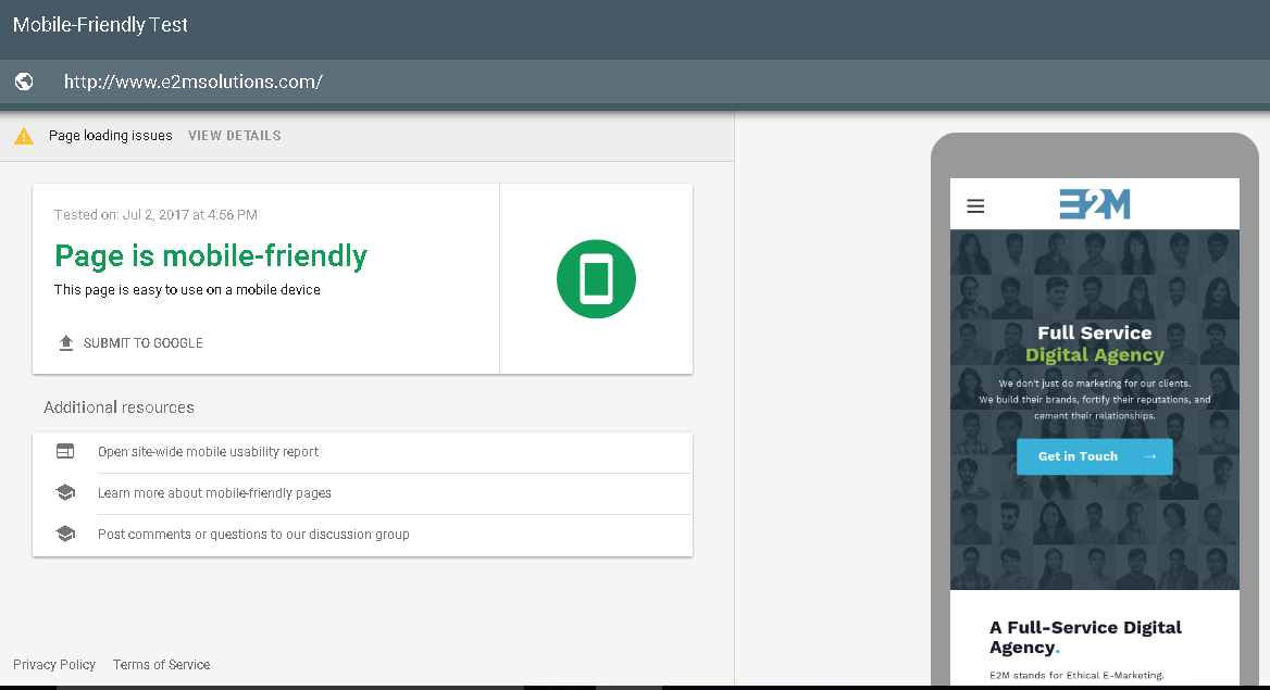
1) Take Google’s Mobile-Friendly Test. Just enter a page URL to see how your page performs on a mobile device.
2) Check the Mobile Usability Report to see and fix potential mobile issues found on your site.
3) If you’re using a CMS site such as WordPress or Joomla, follow Google’s instructions on how to make CMS themes and templates mobile-friendly.
Before doing that, consider the following:
- Back up your site before making any changes or update. It could save your skin if anything untoward happens during the update. It is ideal to create a local backup copy and another in the cloud as an extra layer of security.
- Update your CMS to the latest version. It will automatically install security upgrades and make your site mobile-friendly in most cases.
- Check the support forums of your CMS to view the common issues that people might be having with your site’s mobile version.
What is Mobile SEO and why is it important?
Google’s Mobile-first Indexing
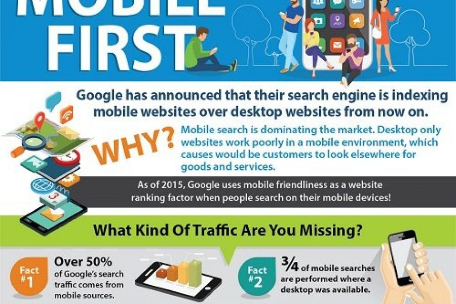
Google gradually made changes to its search algorithm to account for the continued growth of mobile-connected devices. For the past two years, it has reiterated the need to optimize websites for mobile use, and published resources on how to make websites mobile friendly.
And in 2016, Google began experimenting on mobile-first indexing. Although it still uses a single search index of websites and apps for now, search algorithms will eventually prioritize content of a site’s mobile version to rank pages.
Although Google pushes for sites to be mobile-friendly, it still does crawl desktop versions. So you need to make sure the content and links in the mobile version are consistent with your desktop version. This is to make sure that Google can consume the right content and will rank your site in the same way as it did when it crawls your desktop site.
Mobile-first indexing will impact rankings if your mobile and desktop versions are too different from each other. For example, if the page’s mobile version has far less content than the desktop version, Google will treat the mobile version as the original.
Mobile-first SEO strategy
In response to Google’s mobile-first indexing, webmasters also made mobile SEO a priority.
A mobile SEO strategy is more than having a mobile-responsive website. It involves optimizing site resources to let Googlebot know that you indeed have a mobile site to prioritize it in search rankings.
The first step is to make Google understand your site’s mobile configuration. It’s up to you if you want to use responsive web sign, dynamic serving, or separate URL solution.
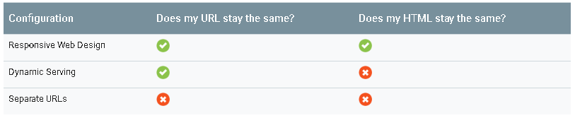
Each mobile solution has its pros and cons. But Google can understand all three as long as you set them up properly.
1) Responsive Design
Google prefers this configuration because it’s easy to understand without extra codes or hints. A responsive web design serves the same HTML code on the same URL across all devices but can render the display differently.
To signal to browsers that your page will adapt to all devices, Google suggests setting the viewport and add this meta tag to the head of the document:
2) Dynamic Serving
With Dynamic Serving, Google recommends that you provide it with a hint that you’re altering the content based on user agent since it’s not immediately obvious that you’re doing so.
This configuration varies HTTP header to inform Googlebot for smartphones to crawl the mobile-optimized version of the URL.
3) Separate URL
You can host a mobile version of your site on separate URLs:
- mobile sub-domain (m.example.com)
- an entirely separate mobile domain (example.mobi)
- a sub-folder (example.com/mobile)
Any of these are okay as long as you properly implement a two-way annotation between the desktop and mobile versions.
4) Accelerated Mobile Pages (AMP)
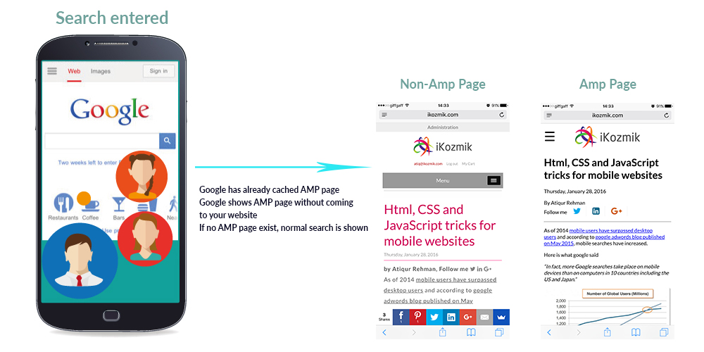
Google has also been pushing AMP over the last year or so. It’s a stripped-down format of HTML so it loads faster. However, there have been grumblings about AMP content in terms of usability and functionality.
Some publishers say it does not deliver as much value as other configurations. That’s because Google indexes the desktop version over AMP when there is no mobile version available.
Regardless of which configurations you choose, here are some key points that you should take note of.
• Signal to Google when a page is formatted for mobile to help Google accurately serve mobile searchers your content in search results.
• Avoid these common mistakes that frustrate mobile visitors:
1) Blocked JavaScript, CSS, and Image Files
If Googlebot doesn’t have access to your page’s resources, it may not detect that the page is “mobile-friendly” and will not properly serve it to mobile searchers.
So keep your resources crawlable. Do not use robots.txt to block search engines from accessing critical files on your site that help render the page, and that include ads.
2) Unplayable Content
Google recommends using HTML5 standard tags to include videos or animations, instead of using a proprietary video player or putting content in unsupported formats.
For animated content using Flash or other multimedia players, you can use Google Web Designer to create animations in HTML5.
3) Faulty Redirects
You need to redirect mobile users to each desktop URL if you have separate mobile URLs for them. This ensures that users end up on the page they were looking for.
4) Mobile-Only 404s
Some sites load properly on desktop but show an error page to mobile users. if you notice a user is visiting a desktop page from a mobile device and you have an equivalent mobile page at a different URL, redirect them to that URL instead of serving a 404 page. Also, ensure that the mobile-friendly page is not an error page.
Do not disrupt the users from completing tasks on your site. Use a simple banner to promote your app in line with the page’s content.
6) Irrelevant Cross Links
Check your links to make sure they direct the user to the correct page.
7) Slow Mobile Pages
Don’t make your visitors wait a long time to see your content. Aim to render mobile pages in less than one second.
8) Small Font Size
Use legible font sizes to make sure fonts will be scaled as expected across various devices. A base font size of 16 CSS pixels is recommended.
9) Touch elements too close
Design your buttons and links for the fat finger to avoid accidental clicks.
The Synergy of Design and Content

Users visit your site for content but they want to exert minimal effort to get the result they desire. Given the limitations on mobile such as screen size and bandwidth, it’s just imperative that design aspects should be focused on highlighting content more effectively.
Having said that, it would be inaccurate to say that content outweighs design, or design is more important than content, in mobile websites. Both elements are equally important across all devices.
But unlike in desktop approach where you can put two pieces of content side by side, you have to have a content hierarchy in your mobile site so the user experience is not sacrificed. The most important messaging always comes on top, such as your company name, logo, and CTA; followed by secondary and tertiary content as determined by context and time sensitivity.
The Importance of Visuals on Mobile

Visual content rakes the highest engagement on mobile. In YouTube alone, 51% of all video plays are on mobile devices. Mobile also accounts for nearly 80% of time spent on social media networks where photos and videos receive more interaction.
When it comes to mobile sites, optimization of images and videos is a must. They attract leads and boost your mobile SEO.
How to Optimize Videos for Mobile SEO
If you need to post a lot of videos on your site, it is ideal to use YouTube videos to make viewing on mobile more seamless. The embed code on YouTube is already mobile-responsive so it automatically adjusts to different screen sizes.
Following Google’s best video practices will also increase the likelihood that your videos will be returned in search results.
- Mark up your videos with schema.org
Schema markup is a language that adds machine-readable information to your content. Adding this to your video content makes it easier forsearch engines to index them.
- Submit a Video Sitemap or mRSS feed to Google
Sitemaps are a great way to ensure Google knows about all the content on your site, including content which might not be discoverable with its usual crawling methods.
- Tell Google when you remove videos from your site
For any landing page where a video is removed or expired, return a 404 (Not found) HTTP status code. You can make this transparent to most users by returning the HTML in addition to the 404 response code.
Next to video results, Google shows thumbnail-sized summary images. It will identify equivalent thumbnail images for your video pages based on the information found on your site, in your Sitemap, or in markup.
- JavaScript, Flash, and hashtags
Do not use overly complex JavaScript or Flash setup when configuring video pages. Google may not correctly show your videos if you do so.
- Create a great user experience
Creating a standalone landing page for each video and providing descriptive titles and captions on each page makes it easy for users to identify video content.
Use a prominent, embedded video player that support different video formats to make your videos more attractive to users and easier for Google to index.
How to Optimize Images for Mobile SEO
In terms of optimizing images, here are some tips and techniques to help your search rankings:
1) Name your images descriptively.
Search engines crawl the text on your webpage and the keywords within your image file names. Look at your website analytics and see what phrasing patterns your visitors use in searching for images. Find the most common naming patterns they use and apply that formula to your image naming process.
2) Optimize your Alt Tags intelligently
The alt attribute adds SEO value to your site. By adding appropriate alt tags to the images, associating keywords with images, and this helps your website rank better in search engines.
3) Reduce the file sizes of your images
A webpage tends to load slower if it contains large images. Since page load time is a factor in Google’s ranking algorithm, your page may be demoted if this happens.
To reduce image size, you can use the “Save for Web” command in Adobe Photoshop. Make sure to keep an eye out for image quality when adjusting the image to the lowest file size acceptable. If you don’t have Photoshop, there are free photo editors that you can try.
4) Know which image file type to use for the right situations
JPEG, GIF, and PNG are the three most common image file types.
JPEG is best for ecommerce sites because they have the best quality in the smallest file size.
Use GIFs for thumbnails and decorative images.
PNG is a great alternative to both JPEGs and GIFS. PNGs can be used as simple decorative images because they have extremely small file sizes. If you only have photos in PNG format, try using PNG-8 over PNG-24.
5) Use image sitemaps
Web crawlers can’t crawl images that are indicated in the webpage source code. To let them know about these images, you need to list their location in an image sitemap.
For the more technical aspects of image optimization, you can refer to the developer’s guide to Image Optimization by Google.
Conclusion
The increasing popularity of mobile-connected devices only shows the users’ passion for immediately satisfying their informational needs. Your mobile site should make it easy for them to do what they need to do without a lot of fuss and distraction.