Digital marketing is becoming increasingly data-driven. However, data makes the most sense when you can easily read, understand, and share it.
Visualization plays a critical role in presenting a complex set of data to your clients and stakeholders in an easy-to-understand manner. Google Data Studio is one of the best tools that can help you get meaningful insights from a ton of data with ease and efficiency. For a digital marketer, it’s a must-have.
We have put together this guide to help you understand what Google Data Studio is, why you need it, and how you can use it.
Let’s start with a quick round-up of what Google Data Studio is.
A. What Is Google Data Studio?
Google Data Studio is a data visualization and reporting tool. It was released in 2016 as a part of the Google Analytics 360 Suite. Its free version became available in 2018.
As this is a simple drag-and-drop tool, no programming knowledge is needed to create customized reports. With this tool, you can create highly interactive, easy-to-understand, and easy-to-share reports.
You can pull data from various sources, including Google Analytics, YouTube Analytics, Google Sheets, Google Ads, Google My Business (GMB), Search Ads 360, Display & Video 360, and BigQuery, among many other non-Google sources as well.
You can share the reports with your team members and clients. Any user you provide with editing rights can also update the reports. Your team members can also edit the same report in real-time. You just need to sign in to your Google account to start using this free tool.
Now that you know what Google Data Studio is, let’s see why you should use it.
B. Why Do You Need Google Data Studio?
As a marketer, you have perhaps come across several different reporting solutions.
So, why choose Google Data Studio?
Let’ take a look at some of the unique Google Data Studio benefits that make it almost irresistible.
1. Free! Free! Free!
That’s right!
One of the most obvious benefits of Google Data Studio is that it is completely FREE. While other paid reporting and visualization tools are available, they are often expensive and require annual or monthly renewals.
Not many businesses, especially small ones, can afford to use paid tools. If you fall into this category, this is certainly a better alternative compared to paid tools.
2. Ease of Use
The intuitive design makes it one of the most user-friendly reporting tools out there. You can create customized Google Data Studio dashboards with just a few clicks without requiring any technical knowledge.
Even beginners can quickly get the hang of things, thanks to its simplicity. Learning to use Google Data Studio is much easier if you are already familiar with other Google products like Google Analytics and Google Sheets.
3. Free Tutorials
If you are a beginner, you can get Google Data Studio training through various tutorials, articles, and videos. You can get free tutorials on everything from creating reports to accessing data resources from the Help menu. Furthermore, you can always check out various online forums if you need more help.
4. Better Shareability
From your branded Google Data Studio dashboards to customized reports, you can easily share any data insight via this tool. This makes it easier to keep all your stakeholders in the loop.
You don’t have to upload or download any files. Like Google Docs, you just need to share a link with your team members and get quick feedback.
But most importantly, you can make real-time changes to any of the shared reports, making it easier to collaborate with multiple teams. Of course, you will need to grant editing access to the concerned team members.
5. Create Interactive Reports
You can use a variety of interactive options like chart interaction filters to create more appealing reports. You can create multidimensional graphs and charts, which allow you to turn a more complex set of data into an easily understandable report.
Plus, you get a vast array of fonts, colors, and themes to make your reports more informative, appealing, and easy-to-understand. You can use these interactive elements to create multipage reports with different data variables as well.
6. Vast Widget Options
With an unlimited number of widgets at your disposal, you can represent the data in multiple ways. From region-based heat graphs to pie charts, there is virtually no limit to your creativity.
Plus, you can use different metrics to modify these widgets depending on your reporting needs. In other words, Google Data Studio makes it easier to convey your data insights the way you want with just a few clicks.
7. Real-Time Data Update
Google Data Studio supports not only real-time editing but also real-time data updates. You can set automated updates for your reports. So, the moment new data is available, your report will get updated automatically. However, you also have the option to keep some of the data fixed.
For example, you can create a report where the last three week’s data remain unchanged, while the current week’s data gets updated as new information flows in. This dynamic reporting can help you make better business decisions.
8. Pre-Loaded Templates
It also comes with free and paid data templates. For example, if you are not familiar with YouTube Analytics, you can use a pre-loaded template for the same to create your reports.
Apart from resources, you can find a few industry-specific templates. You can buy paid templates from third-party vendors to create customized reports.
9. Quick Social Sharing
If you want to share your reports on social media, Google Data Studio lets you do it with just a few clicks. All you need to do is to embed the report link (URL) in your social media post, be it Facebook or LinkedIn.
Seeing the benefits, you may have already made up your mind to start using Google Data Studio.
So, let’s learn Google Data Studio tricks and tips.
C. How To Use Google Data Studio?
Learning to use Google Data Studio is the most important part of this guide. You will need to sign into your Google account to begin.
Don’t be overwhelmed by the vast number of features. After going through these tips, your first encounter with this tool will be a smooth sail.
1. Navigate To The Blank Report
First, you will need to go to https://datastudio.google.com and log in using your Google account credentials. Once logged in, you will see the Google Data Studio interface, which looks quite similar to Google Docs.
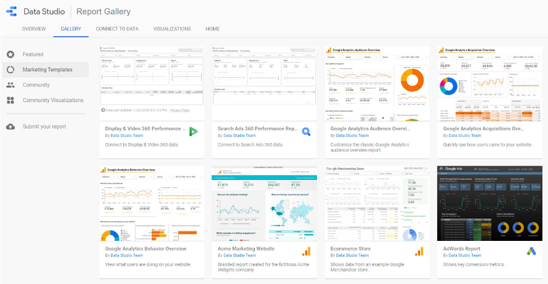
If you click the Template Gallery button, you will see different pre-loaded templates.
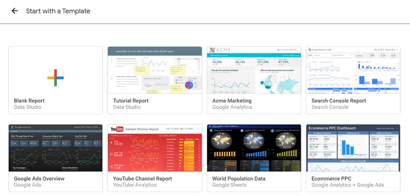
While you can use any of these templates, it is better to start with a Blank Report as it will help you learn about every feature of this tool. Click on Blank Report to start creating your first report.
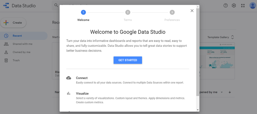
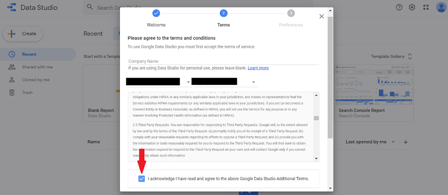
A new pop-up window will open. Click the Get Started button, then check the Agree check box and click Accept to continue.
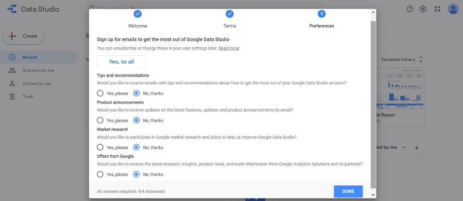
Finally, Google will ask for email notification preferences. You can check the appropriate boxes and click Done. You will be asked to follow this process only once.
After finishing this step, click on the Blank Report template to start creating your report. You will see a blank and untitled report template. Remember to add a title to your report before taking the next step.
2. Selecting New Data Source
The next step is to add a new data source to your report. The easiest data source you can use is Google Sheet. However, if you are already using Google Analytics, you can use that too.
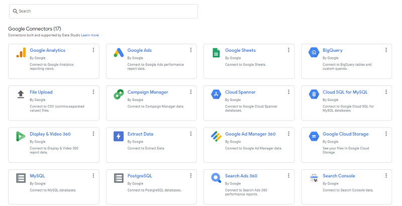
Click on the Add Data button located in the toolbar. You will see 17 different connectors that you can pull the data from.
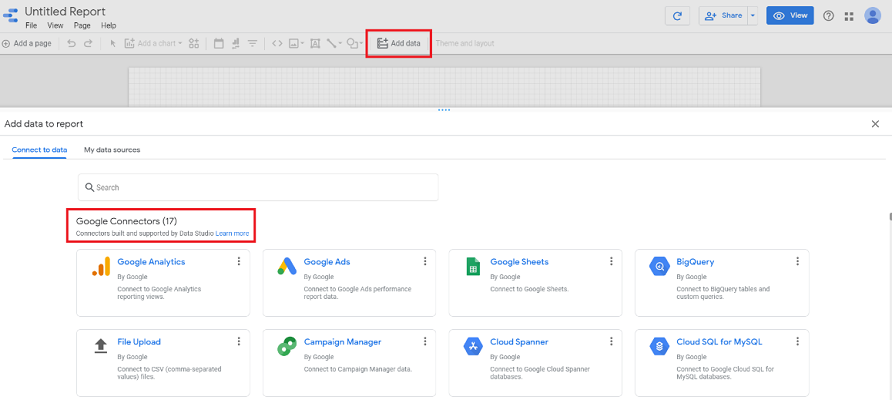
Select the one you want to use. I have selected Google Analytics.
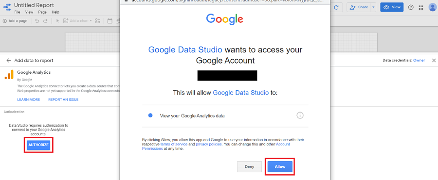
For first-time use, you will need to authorize Google to access the said data. Click on the Authorize button, a new pop-up will open. Click Allow to proceed.
After authorization, you will need to select an account, property, and view and then click the Connect tab. You can see the tab in the upper left-hand corner.
3. Adding Date Range
You will see the data dimensions and metrics for Google Analytics. Select the different data ranges you want to add to the report and click Add. Don’t worry! You can edit, add, and remove any of the data components any time you want.
4. Dashboard Overview
The Google Data Studio dashboard consists of the following:
- Menu: This consists of File, Edit, View, Page, Arrange, Resource, and Help tabs.
- Toolbar: This comes with options like Charts, Themes, and Layouts, Text, URL Embedding, Shapes and Lines, along with Add Data.
- Canvas: This is where you will be able to create and edit your report.
- Sidebar: Sidebar will show various options corresponding to the element you have selected from the canvas.
- Share: This tab allows you to share your report.
- View: This tab takes you into view mode. You will be in the editing mode by default.
It is better if you can play around with these options to get a feel of how Google Data Studio works. Practice will make it easier to create reports.
5. Adding Report Title And Text Box
While you may have already named your report file, you should also add the title to the canvas. Click on the Text tab in the Toolbar to open a text box on the canvas.
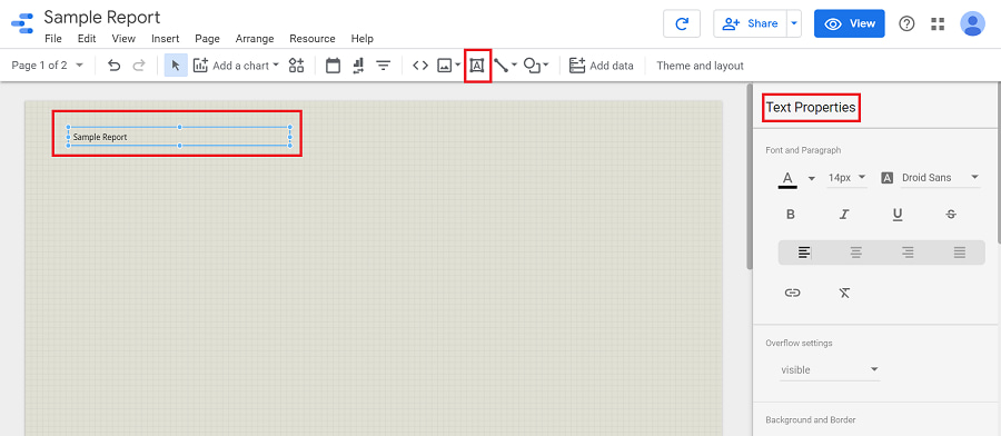
You can use various options from the sidebar to change color, font, size, background, and border as you wish. Similarly, you can add short descriptions in your report through this feature.
6. Adding Charts
When you click Add a Chart in the toolbar, you will see different types of charts you can add to the report. From simple tables and scorecards to geo maps and tree maps, you can add a chart that suits your purpose.
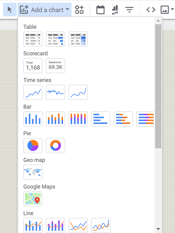
As we are considering Google Analytics sample data here, let’s talk about a few relevant charts.
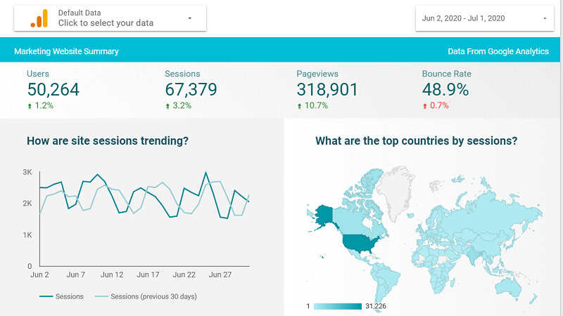
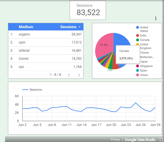
a) Scorecard
You can use Scorecards to represent the important KPIs in your Google Analytics report.
- Click the Scorecard tab from Add Chart menu.
- Select the Style tab from Sidebar to edit scorecard.
- Select the Data tab from Sidebar and select appropriate data range. Auto is the default option.
- Right-click on the scorecard and click Duplicate to create a copy of this Scorecard.
- Duplicate scoreboards will have the same style and configuration.
- To add a new Metric, go to the Data option in Sidebar and select one of the metrics under Available Fields.
- Click, drag, and drop the field on the desired Scorecard.
- If any KPI numbers are too large (like Revenue), you can select the Compact Numbers option from the Style tab in the Sidebar.
- Repeat this process to add different KPIs.
b) Geo Map
Geo Maps allow you to represent data like revenue or incoming web traffic by region. Usually, the data will be presented in different shades of color or different color combinations.
- Go to Add Chart and select Geo Map.
- Go to Sidebar and select a particular region such as a Country or a State.
- Got to Metric and select an appropriate option like Revenue or Page Views.
- Use a Text Box to name the map. For example, Revenue by State or Page Views by State.
c) Time Series
Time Series charts can help you represent data like site visits, a number of clicks, and a number of unique page views, among other trends over a selected period of time. This data visualization will often be the crux of your Google Analytics report.
- Select the appropriate time series from the Add Chart menu.
- Select the desired option from the Style tab in the Sidebar to jazz up your time series chart.
- Go to the Data tab to select the desired metric and add it by simply clicking, dragging, and dropping.
- You can select multiple charts and add them directly to the report.
- To create a duplicate chart, right-click on it, and select Duplicate.
- You can add a different metric or click the “X” next to a metric in the Data tab to remove it.
- Duplication comes in handy if you want to add only one metric per chart.
You can check the box for Cumulative under the Style tab if you want to see a cumulative change in your data (such as revenue) over time.
Similarly, you can use the Trendline drop-down menu under the Style tab to add a trend in your chart. However, make sure to uncheck the Cumulative box.
d) Pie Chart
You can use this chart to divide the data into different sets of users based on gender, age, resources, or regions, among other things.
- Select a Pie Chart from the drop-down Add Chart menu.
- Select the appropriate dimension and metric from the Data tab in Sidebar.
- Use the desired option under the Style tab from the Data tab in Sidebar. For example, you can choose Percentage, Label, or Value to name the slices.
- Use the duplication processes to create more than one pie chart with a consistent style, but different data.
e) Bar Chart
Bar charts are also equally popular when it comes to Google Analytics. You can represent a variety of data using these charts. For example, you can break down a number of online sales conversions by regions such as states or cities.
- Select a bar chart from the drop-down Add Chart menu.
- Select the appropriate dimension and metric from the Data tab in Sidebar.
- You can toggle fonts, text, stacking, labels, axis titles, background color, legends, and chart headers as you want.
7. Other Important Toolbar Features
While adding and editing different charts and text boxes are the two primary features you will use as a beginner, there are a few other important Google Data Studio toolbar functions you should also know about.
a) Add Page
It allows you to add a new page to your report. You can create multipage reports if required.
b) Community Visualizations And Components
With this tab, you can access customized visualizations and components created by third-party developers that you can use in your report. They can add more appeal to your report and help you represent the data where in-built visualizations aren’t enough.
c) Add Data
With this tab, you can import data from additional resources. For example, you can create a report that requires data from both Google Analytics and Google Sheets.
d) Shape
To add to the visual appeal, you can add rectangles and circles of different sizes and colors (borders and background) to your report using this feature.
e) Line
You can add lines, arrows, and connectors (elbow and curved shape) to connect different components in your report using this feature.
f) Image
This feature allows you to add images to your report. You can add an image from your computer or a URL if you are getting it from an online source.
g) URL Embed
With this feature, you can bring external content to your report. Select URL embed and simply copy-paste the desired URL into your report.
You can insert URLs of Google Docs, Forms, and Sheets, YouTube videos and also live webpages, among others. It is a useful feature, especially if your report needs additional context or reference.
h) Redo And Undo
You can undo or redo your last command using this option. Of course, “Ctr + Z” works too!
i) Theme And Layout
You can select a theme, create a customized one, and toggle the layout as you desire using this option. You can see these tabs in the sidebar located on the right side.
While these options will make your report look great, it may still lack the interactive element. Interactive reports can help your clients understand the data more easily.
8. Create Interactive Reports
Let’s take a look at some of the advanced options in Google Data Studio that allow you to create interactive reports.
a) Data Control Filter
Data control allows your team members or clients to view the report using a set of data they have access to.
Let’s consider a hypothetical scenario where ABC creates a Google Analytics report for website D and shares it with XYZ by adding data control.
Now XYZ can view this report with the default data for client D. However, if XYZ has access to data for website E, they can use the same report to display the data for website E.
- Select the Data Control dropdown tab from the toolbar.
- Select the type of connector you want from the Data tab in the sidebar.
- You can change the appearance using various options in the Style tab.
- You can add multiple Data Controls in your report.
At present, however, Google Data Studio supports only six types of data controls, including Google Analytics, YouTube Analytics, Google Ads, Campaign Manager, Search Console, and Google Ad Manager 360.
b) Filter Control
With this interactive feature, viewers can focus on different subsets of data in your report. For example, in a Google Analytics report, you can allow viewers to view incoming web traffic data or revenue from different age groups using this feature.
- Select the Filter Control tab from the toolbar.
- Go to the Data tab in the sidebar and change the Dimension to Source/Medium.
- Use the duplication process to create more copies of this Filter Control.
- Select a different Dimension (drag and drop) such as Device Type or Region or User Type for the new Filter Controls.
c) Date Range Filter
With this feature, you can enable your viewers to select a time frame for the report. As a result, viewers can see the data for a particular duration of time, helping them make better sense of the data.
Date Range will appear as a calendar widget in your report. You can make it appear on every page of your report.
- Select the Date Range tab from the toolbar.
- Place it on your report.
- To make it appear on every page, click on Date Range box, select Arrange from menu bar, click on Make Report-Level.
- Users will be able to select a start and an end date to see the data accordingly.
9. Customizing Metrics And Dimensions
Another advanced feature that allows you to customize data metrics and dimensions. Sometimes, your report needs to answer a few questions that the data from the pre-loaded resources can’t provide. That’s where customization comes in.
Customized data metrics and dimensions can interact with the preloaded data easily. So, you can use a combination of customized and preloaded data in any way you want.
To use this feature, however, first you will need to add a data source and create a chart or a table.
a) Dimensions
To add a customized dimension,
- Click on the desired chart and go to the Data tab in the sidebar.
- Click the Add Dimension button.
- Click the Create Field button.
- Select the appropriate filed to create the customized Metric.
b) Metrics
To add a customized metric,
- Select the desired chart and go to the Data tab in the sidebar.
- Select the available metric.
- Click the Create Field button.
Or
- Turn the Optional Metrics field on.
- Click the Add Metric tab.
- Click the Create Field button.
After following one of these steps,
- Select the appropriate filed to create a customized Metric.
With these features, you can customize the metrics and dimensions using the following functions:
- Formulas
You can add mathematical formulas such as POWER, MIN, MAX, and SUM among others, just like you would in an Excel Sheet. - Arithmetic
Adding simple mathematical operations like addition, subtraction, multiplication and division. - Comparison
Using logical comparison formulas like IF/ELSE to compare different sets of data, attributions, or values. - Currency
Add currencies of different countries. - Numerical
It includes options like percentage, seconds, and numbers. - Date and Time
Add date and time in different formats including ISO Year Week, Quarter, and Month, among others. - Boolean
Add Boolean formulas like AND, OR, XOR, and NOT to compare data values. - Geographical Data
Add geographical information ranging from address and postal codes to country and continent names and codes. - Text
Add text-based information or data descriptions. - URL
Add the URL from an external source. You can add it as an URL or an image.
10. Adding Additional Data Sources
By default, you will see data from only one source in the Charts. However, you can also add data from more than one resources. The https://datastudio.google.com tab allows you to add data from two different sources so that you can calculate the performance of your website or digital campaigns more efficiently.
- Select the Chart where you want to add additional data sources.
- Go to the Data tab in the sidebar.
- Select the Blend Data tab.
- Click the Add Another Data Source tab from the pop-up.
- Select the desired data source.
11. Sharing Your Report
Once you have created your report, you will need to share it with your clients or teammates or both. Google Data Studio comes with a few in-built sharing options. You can select one of the following options from the dropdown Share tab located on the upper right-hand side.
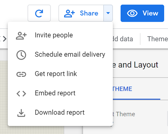
a) Invite People
Using this option, you can invite people to view or edit your report. You will need to add email addresses of the people you would like to invite. You can manage access to the report as well.
From allowing only specific people (those in your list only) to allowing anyone on the internet to find and make edits, you can change accessibility as you want. You can also prevent editors from granting other people access to the report.
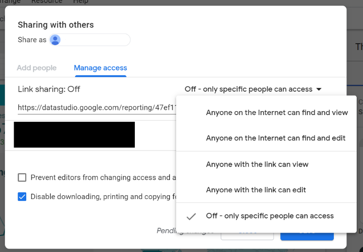
Furthermore, you can disable downloading, printing, and copying for viewers, offering you more control over your report.
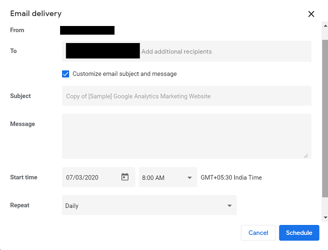
b) Schedule Email Delivery
You can also schedule report-delivery using this feature. If you check the “Customize email subject and message”, you will be able to send a message with a relevant subject line to the recipients.
Click the dropdown Repeat tab to select a suitable schedule. You can send the report daily, weekly on Fridays, monthly on first Fridays, every weekday, or set a customized schedule.
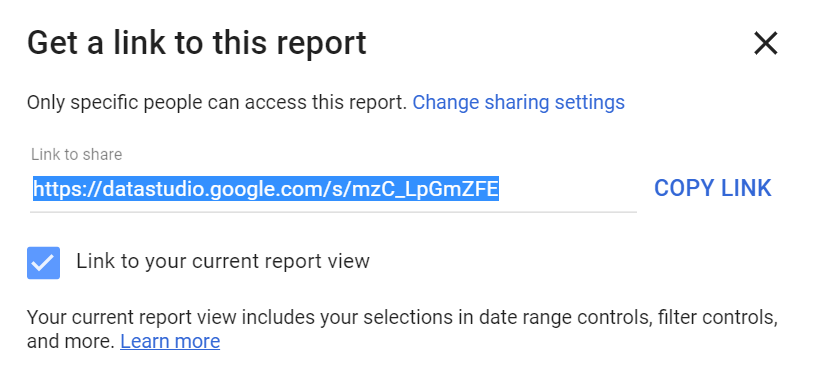
c) Get Report Link
Another way to share the report is to create a link. You can copy and paste the link easily using this option. Thus, you will be able to share the report on a social media platform like Facebook or Twitter.
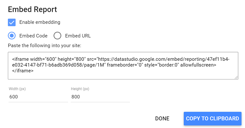
d) Embed Report
With this function, you can embed the report into your site as a URL or a code.
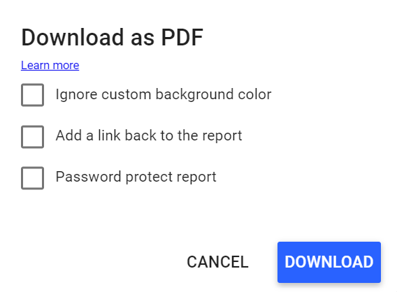
e) Download Report
You can download the report as a PDF. You can make the following adjustments while downloading the report:
- Add a link back to the report.
- Ignore the custom background color.
- Add a password to protect the report.
All you need to do is check the suitable box. You can check multiple boxes as per your requirement.
Apart from these features, there are a few advanced ones that you can use to create highly customized reports. One of these features is building your own Google Data Studio Connector.
D) How To Build A Google Data Studio Connector?
Connectors allow you to pull data from a particular data source after authorization. Some may also require you to provide additional parameters. As you may already know, you can import the data from preloaded connectors.
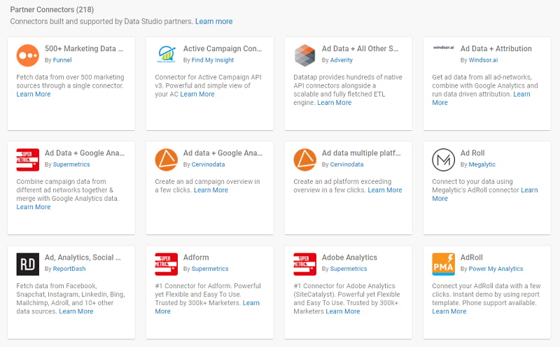
At the time of writing this guide, there were 17 Google Data Studio connectors, three open-source connectors, and more than 200 Google Data Studio partner connectors.
However, you can also build your own connectors using Google Apps Script. Customized connectors allow you to leverage Google Data Studio for reporting to a wide range of data. You will, of course, need some level of technical knowledge (developer) to build customized connectors. So, you can consider using this feature once you have mastered the simple ones.
Parting Words
As you can see, Google Data Studio is a vast topic. This guide takes a closer look at the key features and functions that should help beginners acclimatize to this reporting and visualization tool. Practice plays a critical role in mastering this tool. Hopefully, this guide will hit the ground running for you. We would love to keep this conversation going. Feel free to ask your doubts and share your experiences with us in the comments section.